

Infographics (of varying levels of usefulness) are a common sight on the web these days. Designers love how they can communicate a complex set of ideas in simple, visual terms. Readers like them because they can quickly scan data and research to gain a broad understanding of the content.
Have you considered incorporating infographics into your eLearning? If not, you should. They can easily live inside an eLearning course, and are a terrific change of pace for learners.
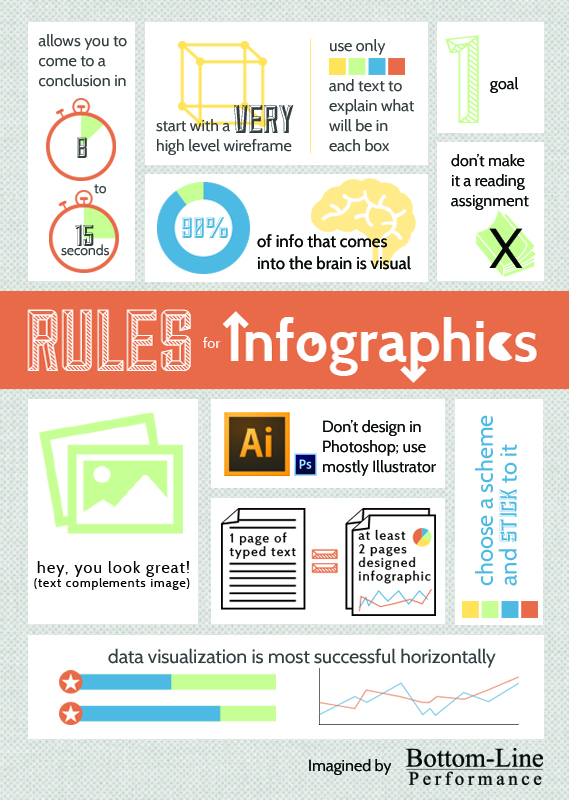
Senior Learning Technologist Christa Music Nimmer put together an infographic summarizing the best practices to consider when using infographics in eLearning. Have a look at her tips for designing infographics below.
Tips in Review
- Make it skim-able: The infographic should allow learners to come to some type of conclusion in 8 – 15 seconds.
- Start with a wireframe: Keep it high level! Use colors and text to explain what will be in each box.
- Choose one goal: Keep your infographic focused. Don’t try to do too much.
- Focus on visuals: Up to 90% of the information our brains absorb is visual. Keep this in mind as you design and don’t turn your infographic into a reading assignment. Text is okay, but only as a complement to your images.
- Use the right amount of content: One page of typed text equates to roughly two pages of designed infographic. Go over this proportion and your infographic will appear cluttered.
- Stick to a color scheme: Don’t get too crazy with your colors. Choose a three or four color palette and stay within it.
- Visualize data horizontally: People read and process information from left to right, so your data visualizations should move this direction, too.
You might also be interested in:

