


Welcome back to our #BLPLearn blog series, where we offer a monthly look at design and technology as it pertains to learning and development. I’m your host, Jake Huhn… Senior Marketing Technologist at Bottom-Line Performance.
Let’s Talk About Responsive Web Design
As many of you can attest, it’s difficult to remain on the cutting edge of technology when it comes to training. Whether it’s resistance within the organization, or a limitation of your existing tools like a bloated LMS or ancient browser requirements. But you work hard to bring learners the best possible experience in the best possible environment.
[av_promobox button=’yes’ label=’Access’ link=’page,13321′ link_target=” color=’theme-color’ custom_bg=’#444444′ custom_font=’#ffffff’ size=’large’ icon_select=’no’ icon=’ue800′ font=’entypo-fontello’ box_color=” box_custom_font=’#ffffff’ box_custom_bg=’#444444′ box_custom_border=’#333333′]
Want to learn more about responsive design? Access our webinar: The Mobile Mindset: How to Wow Your Learners.
[/av_promobox]
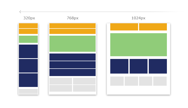
However, the best possible experience and the best possible environment are rarely one-size-fits-all. That’s what responsive design is all about. To better illustrate, here’s a quote from martial arts master, Bruce Lee:
“You must be shapeless, formless, like water. When you pour water in a cup, it becomes the cup. When you pour water in a bottle, it becomes the bottle. When you pour water in a teapot, it becomes the teapot. Water can drip and it can crash. Become like water my friend.”
Your design must be like water. Use fluid grids and flexible elements. Use percentages, not fixed sizes. Use media queries to read device width and adjust accordingly. These are the fundamentals of responsive design.
What can responsive design teach L&D?
All of us in the L&D industry are striving to provide great experiences for our learners. My preaching on responsive design isn’t just about multiple devices. It’s about sustainability and adaptability.
How many of you are in the process of updating old eLearning courses because they’ve become all but unusable with modern technology? It happens all the time. What if we started planning for things to change, rather than just playing catch up? I’m not saying you’ll never have to update a course if you design it according to the principles of responsive web design, but I can guarantee it will be easier. These principles encourage design that is modular and flexible. Traits that go beyond just fitting different device widths.
Let’s Talk About Authoring Tools
Now I’ll relent from the sermon to come back to reality: much of eLearning is designed with authoring tools. Yes, you are limited by the tools. Some of them are starting to allow for responsive design, but it is hardly the cleanest code… and they’re only coming around slowly. That’s why I think it is essential for your department to start embracing learning solutions that don’t come from an authoring tool. I’m not asking anyone to abandon the tried-and-true… but to test the waters.
Here at BLP, we’ve developed several of these learning solutions already. Whether it’s a custom web-based application, or a website-type portal with multiple resources and skill-builders. The technology is out there, we just need to embrace it. You may be surprised at how efficient and cost-effective it really is… especially if your content is constantly changing.
That’s it for this month’s #BLPLearn. I’m signing off with this: Challenge yourself to break free from the traditional. Become like water my friend.

