
One of the most common criticisms of eLearning is that it contains too. much. content. Screens of text with a “Next” button. Maybe an image if you’re lucky. Have you ever seen a course like this one? Hopefully not for a long time.
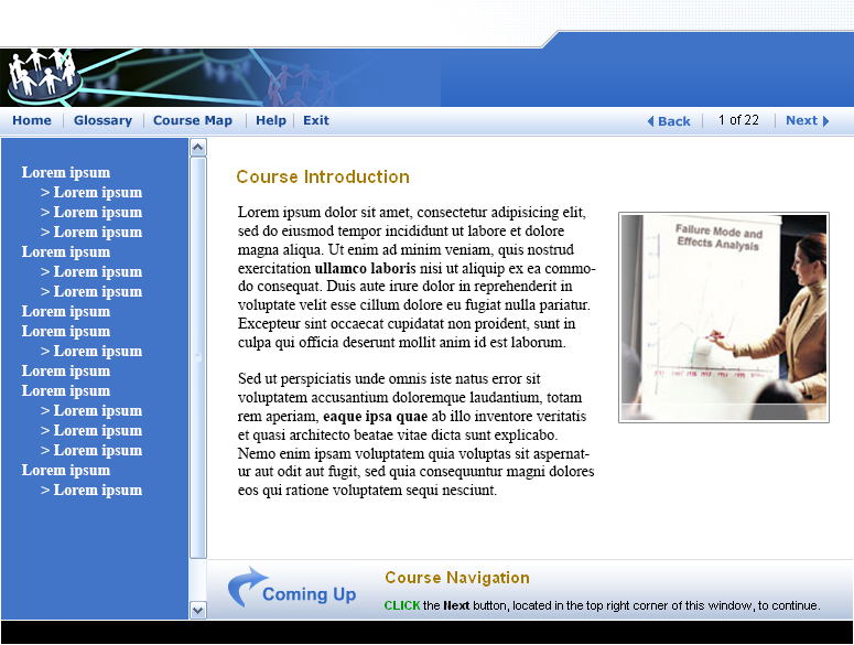
Most instructional designers started out as writers in another field… which might account for some of the verbosity. But the words also start flowing when subject matter experts get a hold of a course. They know the content and consequently have a hard time knowing how much detail is too much.
If your organization is pumping out content-heavy eLearning and you want to find a better way, take a look at the simple tips below.
Show and Tell
Leanne Batchelder, VP of Client Relations, coaches her clients to learn towards a 1:3 ratio of “tell” to “show.” That’s right: only 1/3 of an ideal training solution is a “tell.” That means the other 2/3 is either a “show” or an opportunity for learners to “do.”
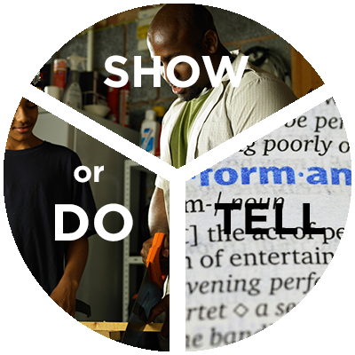
With that simple 1:3 theory in mind (and it’s not an absolute, of course), your eLearning courses or even lectures will feel more engaging to learners.
Example:
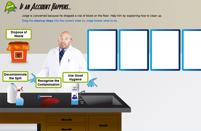
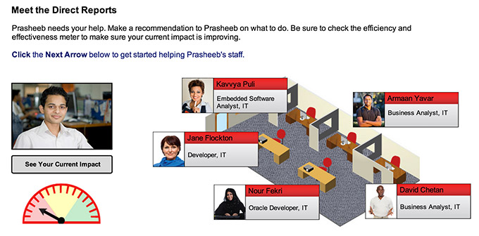
In this course, learners receive most of the “tell” through short, engaging videos. The majority of the gamified course is “do,” with learners completing activities to master each level and successfully avoid bloodborne pathogens.
If you receive objections to a more visual, interactive approach, Leanne recommends pointing out how people read articles on the internet. We all know how to skim and look for visuals as cues to an important section. Heck, you’re probably skimming this blog post as we speak!
There’s nothing more demotivating to a reader than large paragraphs of text. To avoid this, Leanne recommends doing a paragraph check in your eLearning. If you have too many paragraphs in a row, you may inadvertently be giving learners a visual cue to “move on.”
Provide a Resource Tool
“But our people need all of this information for their jobs. We HAVE to include it in the course!”
If you hear an objection like this while trying to make your eLearning more streamlined, consider using a reference tool. Whether it’s an easy to navigate PDF with a clickable table of contents or a mobile app, make your reference tool house all the content learners need to reference at some point without ever having to know it cold.
If the bulk of the “tell” is in a reference tool, the eLearning can focus on scenario-based activities where learners use the reference tool along the way to find information. In some cases, Leanne suggests shifting learning objectives so that learners are taught where to find information, which is much more achievable in an eLearning environment. By designing your course in a way that makes learners use the reference tool the same way they would access it on the job, you will help them realize its value.
Examples
While we design all sorts of just-in-time performance support tools (Leanne would be happy to show you a mobile app!), one of the most cost-effective ways to present support resources is a simple PDF document.
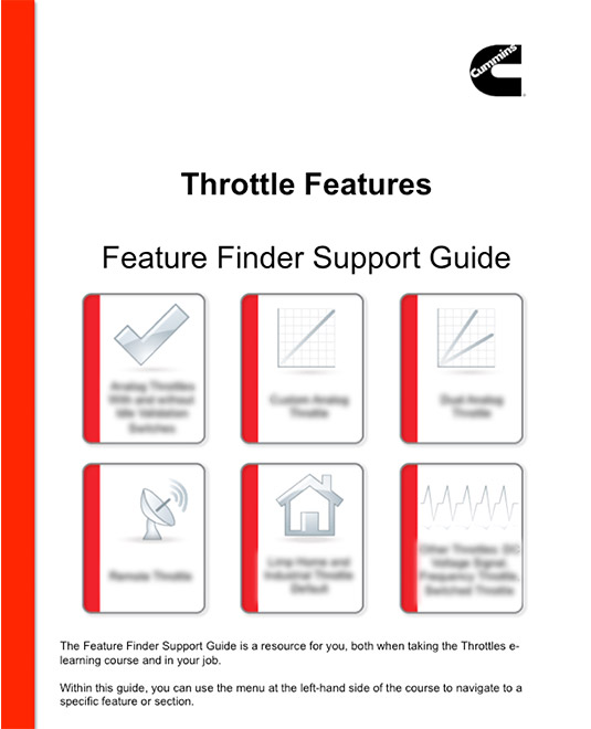
The image to the left was the title page of the Support Guide for an Electronic Features course we developed for Cummins. The course is one of seven Electronic Features courses in a series… each one with its own feature finder guide.
By moving the bulk of the content to the resource guide, the actual courses focus on “What would you do?” scenarios and “See it in Action” “show” sections. Learners use the resource document above to find the necessary information. Each of the six icons is clickable, navigating to the correct section.
Another Example:
Cummins asked us to create a learning solution on 18 internal leadership processes. Learners do not need to memorize the processes, but they must know where to access them. We created an interactive PDF where they must go to find more information. In the course itself, learners select from a group of managers in different geographies, all managing 4-5 employees. Each day, learners must locate the leadership processes needed to solve day-to-day problems.
By moving the bulk of the “tell” to a reference guide” and reinforcing the need throughout the course for learners to access the guide to complete scenarios, we were able to make the course more streamlined and interactive:
Remember: eLearning should not be a book! Keep the 1:3 ratio in mind and count those paragraphs to avoid “skimmable” eLearning. And if the goal is not to memorize but to locate, consider moving content into a resource tool.



Thanks for the nice
article. I am a new reader of this blog and really appreciate all of the good
information on it. I do agree that instructional designers need to keep textual
content to a minimum. However, I also think there are times when the ‘page
turner’ course is necessary. The important element is that it only appears up
front to be a page turner while employing a variety of techniques to limit
cognitive overload and support learner engagement. For example, I develop
elearning for users of high performance computing systems. The topics are very
technical such as how to use a particular programming model for a scientific
application. I work with SMEs to develop the content and have a ‘fun’ time
eliminating unnecessary information and chunking the content to make it easier
to learn. I do this by letting the learning objectives guide what is and what
is not important to include. Although they may look like page turners, these
courses include examples, practice exercises, and self-tests. When I think it will
get the point across better I use visuals. I would like to use more visuals but,
unfortunately, I don’t have the resources needed for that. On the other hand, the
audience might even be put off by an excessive amount of visuals. Maybe the
differences lie in the target audience and topic and/or corporate versus
technical training?