

If you attended ATD TechKnowledge this year, then you might have seen a session about this new thing called The Mobile Mindset and it’s all about mobile learning basics. Steven Boller and myself presented on this topic in front of a rather enthusiastic audience. We were excited to see just how ready people are to do something—anything—to get mobile learning started at their organization.
I coined the term Mobile Mindset to encompass a broader range of programming and design that’s accessible to all organizations—the ones trying to roll out mobile now and those who still have hurdles to overcome. Mobile Mindset means thinking about programming and design in a way that is adaptable for the future. It means improving the design of even your desktop eLearning courses so you’re prepared for whatever device/browser/version comes our way.
It’s worth noting that the significance of the Mobile Mindset goes beyond just successful mLearning. Research shows that using good design principles increases the effectiveness of learning and retention. So without further ado, here are six mobile learning basics to improve your training with the Mobile Mindset.
1. Be conscious of your space.
Space is a precious resource on a mobile device. We love that our smartphone is small enough to carry anywhere in our pocket, but that tiny screen doesn’t allow for much content at once. That means you need to organize and prioritize your content. I’ll say it again because it’s so important: organize and prioritize.
You need to group “like” things together, and use clear space to separate individual ideas. You need to emphasize important points with callouts or highlights—and please remember, if you emphasize everything, it’s basically the same as emphasizing nothing. If you design all your courses—mobile or desktop—with a better usage of space, you’ll see an improvement in training outcomes and learner adoption rates. Read this article to get a more in depth look at the benefits of good, clean design.
2. Think modular and flexible.
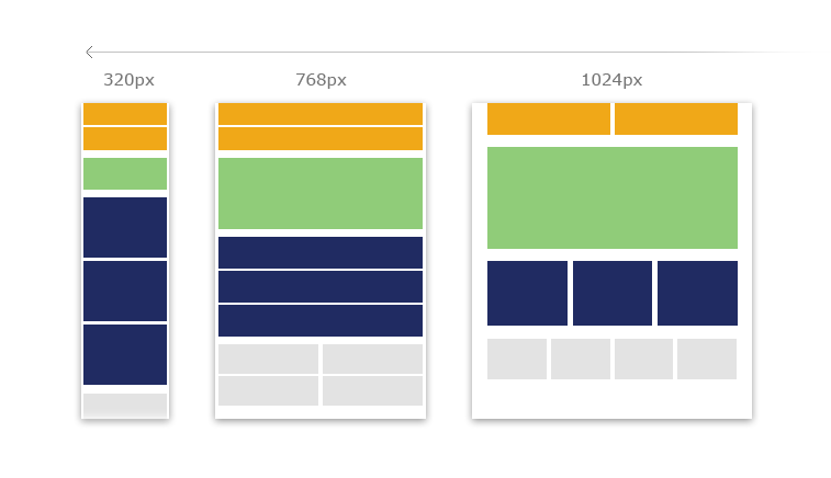
A major part of designing for mobile devices is something called Responsive Web Design—and the ideas behind RWD are integral to the Mobile Mindset. Group your content in such a way that when it is moved around, everything that’s supposed to be together, stays together. That’s what it means to be modular and flexible.
Design and program in a way that allows you to remove a section without breaking the entire thing. Build in a way that allows your content to respond to different screen widths. Build in a way that other people can understand your code.
3. Think beyond authoring tools.

Authoring tools are great for a lot of things. They’ve become much easier to use over the years, and now designing an eLearning course can be as simple as designing a PowerPoint. Okay, that might be an exaggeration, but authoring tools have definitely done some good things for the industry.
Unfortunately, authoring tools come with a few serious limitations. Besides needing a license just to be able to edit a course, authoring tools often inject strange code when they’re published that can create time-consuming and completely unpredictable problems. They rely on cumbersome shells/frames to display content (unless you have some serious hackers on your team). Developers and instructional technologists like ours know how to navigate these challenges, but they can create very real challenges if you are not prepared for them.
Authoring tools have become so ingrained in L&D that we often forget you don’t have to use them! There are other ways to build a course. Which brings me to my next point…
4. Consider the website as a training tool.
One of the alternatives to an authoring tool is something you may never have considered before: a website.
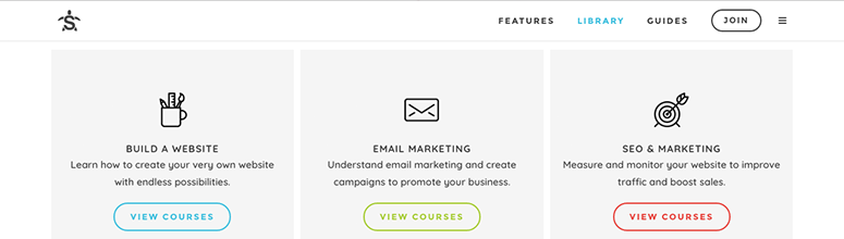
Have you ever visited a beautiful website designed to market something? Nowadays, these sites can have questionnaires, games, interactive content, and tracking like you wouldn’t believe. So why can’t we harness this power for eLearning? Well… you can. And it’s easier than you might think!
There are a few different ways to approach it, too. You can build from scratch with HTML/CSS/Javascript. You can use an open source framework like WordPress, complete with an extensive user community and easy-to-use plugins. I even talked to a gentleman after our presentation at ATD TechKnowledge who said his team uses Adobe Muse to build web pages for eLearning. (Love the creativity!)
5. Design with the future in mind.
This one might be the hardest to follow, because who has time to think about five years from now when there are fires to put out now?
But I want to encourage you to design in such a way that things can adapt when technology changes in the future. This ties back to a lot of my previous points: being modular so that content (especially interactive content and video) can be easily swapped or changed, coding in such a way that a newcomer can read it, and occasionally leaving the authoring tool behind.
All of these are ways to design with the future in mind. Think of it this way… are you building a house of cards?
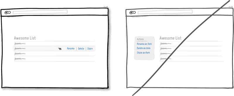
6. Take the training wheels off. Learners can handle it.

As a designer, this final tip is my favorite. I understand why we needed “click the X to the left to exit the window” in the early days of the Internet… but it’s 2017. Learners have matured in their technology use. I bet almost every person who reads this post has used a phone at some time to navigate the Internet.
(Most) People understand where to click by now. They understand exit icons and they understand the “Back” button. We no longer need to waste so much space and effort on these things. Instead, we need less cognitive load and more room for users to learn what they need to know. And we can achieve this through better design.
Yes, there will always be exceptions… especially in certain industries. But in general, it’s safe to embrace a little minimalism. Learners can handle it.
View our recorded webinar, The Mobile Mindset: How to Wow Your Learners, and learn how mobile design can help you create better training.


